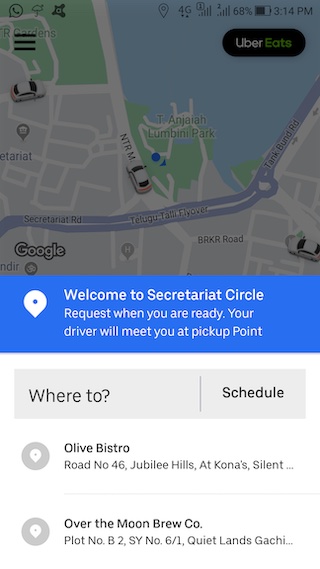
Context: UX Audit for Uber India App

It’s 8:30AM. You are a regular office goer and are looking to reach office at 9:30AM. You generally use Uber for commute whether it is office or any other place.
Based on the above baseline scenario, you need to do a UX audit of Uber’s cab booking flow and find out top 2 fixes that could improve the overall experience.
Apart from the baseline scenario, you can make any assumptions you feel like about the other elements:
- The type of cab (Pool, UberGo, XL etc)
- City/locality you are booking from/to (within India)
- Payment modes you use (card/wallet linked not/linked)
- Whether you compare on a competitor app before booking etc.
(This is not an exhaustive list but is meant to aid thinking)
In essence, you need to fix 2 UX gaps that you observe or are likely to observe in this flow.
While user research is not essential in this case, it can be used to gain some additional insights.
Please note:
- The fixes are specifically aimed at the booking flow. Hence, this is an existing user and we are not looking for fixes in onboarding, acquisition, improvements in marketing, customer support etc. The use case is booking flow only.
- While the primary interface for the fixes is the app, you need not restrict yourself to it. Essentially, you need to think about the overall experience of booking (including what you are going through in the physical world). Can there be fixes/improvements in this dimension as well? (Bonus points for this)
- If you are using screenshots, it’s a good practice to annotate them
- You can solve for any one platform: Android or iOS
- Uber is NOT hosting this challenge. This is a Learning exercise. However, all top solutions will be shared with Uber India team
Resources:
iOS app & Reviews
Android app & Reviews


