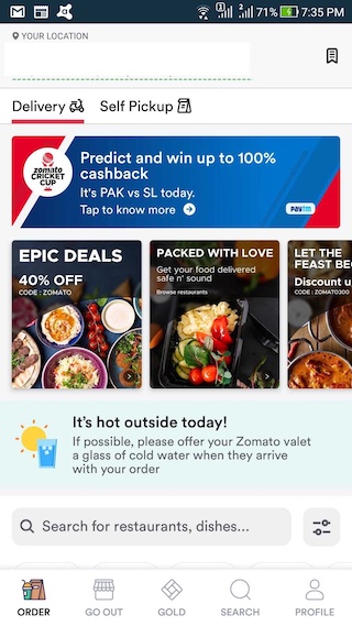
Context: App Redesign to Declutter


Zomato has fast emerged as the go to app for food, be it ordering or discovering food. With intense competition between Zomato and Swiggy (and to some extent Uber Eats), delivering a great user experience matters even more so.
While Zomato offers its users a rich platter of data to aid purchases, since its redesign it has ended up collecting a lot of clutter. This becomes even more apparent when compared to its rivals.
In this challenge you need to find clear ways in which Zomato’s app can be ‘decluttered’ while preserving functionality.
You can choose any one screen to de-clutter (we recommend the home screen).
You can either list out the changes that will aid a better user experience or choose to redesign the screen with low fidelity designs/wire frames.
Do note that important functionality and data points must be retained. In essence you will need to decide what is important and what is not.
We also recommend research through user tests and observations, so as to remove any bias. Extra points if you can justify the changes you are making.
App Links:
Android: Click Here
iOS: Click Here
Important points:
- If you are using screenshots, it’s a good practice to annotate them
- We are NOT looking for beautiful redesigns, but low fidelity designs/wire frames ONLY
- You can solve for any one platform: Android or iOS
- Zomato is NOT hosting this challenge. This is a Learning exercise
- For those outside India or if you are unable to use Zomato for any reason, please drop us a line at support@uxhack.co so that we can share screens with you


