TDS Dividend email looks scarier than it is
Here's a classic case of how a lack of UX principles in important emails makes it lose the purpose for which the Email was sent in the first place. Example here is of TCS Dividend email

If you directly invest in the Indian stock market and if you are eligible for a dividend income from a company, most likely you would have received a mailer with a subject line like Tax Deducted at Source (TDS) on Dividend
Not sure who has the responsibility of designing these emails but definitely looks scarier than it is.
This is a classic case of how a lack of UX principles in important emails makes them lose the purpose for which it was sent in the first place :)
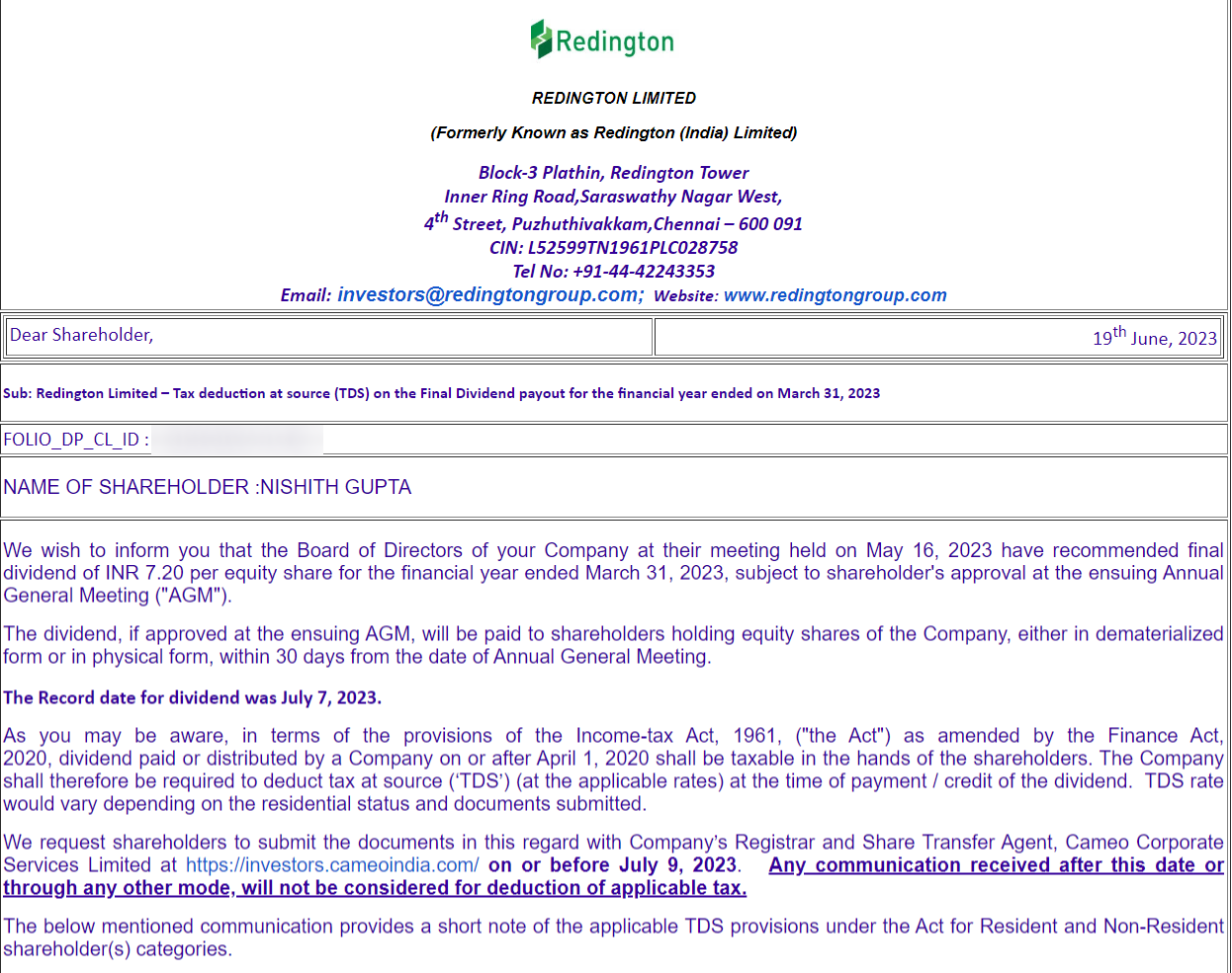
When I received this email for the first time, it felt like they have already deducted some tax just after reading the subject line. Sharing here the most recent one I got from Redington:

But when you look at the actual content, it is mainly for those whose PAN has not been updated with Depository or if it's an invalid PAN/without PAN. They are the ones for whom a higher TDS of 20% will be deducted. This content resides in the table that comes in after almost two paragraphs. Check below the main email copy (sharing only the relevant parts):
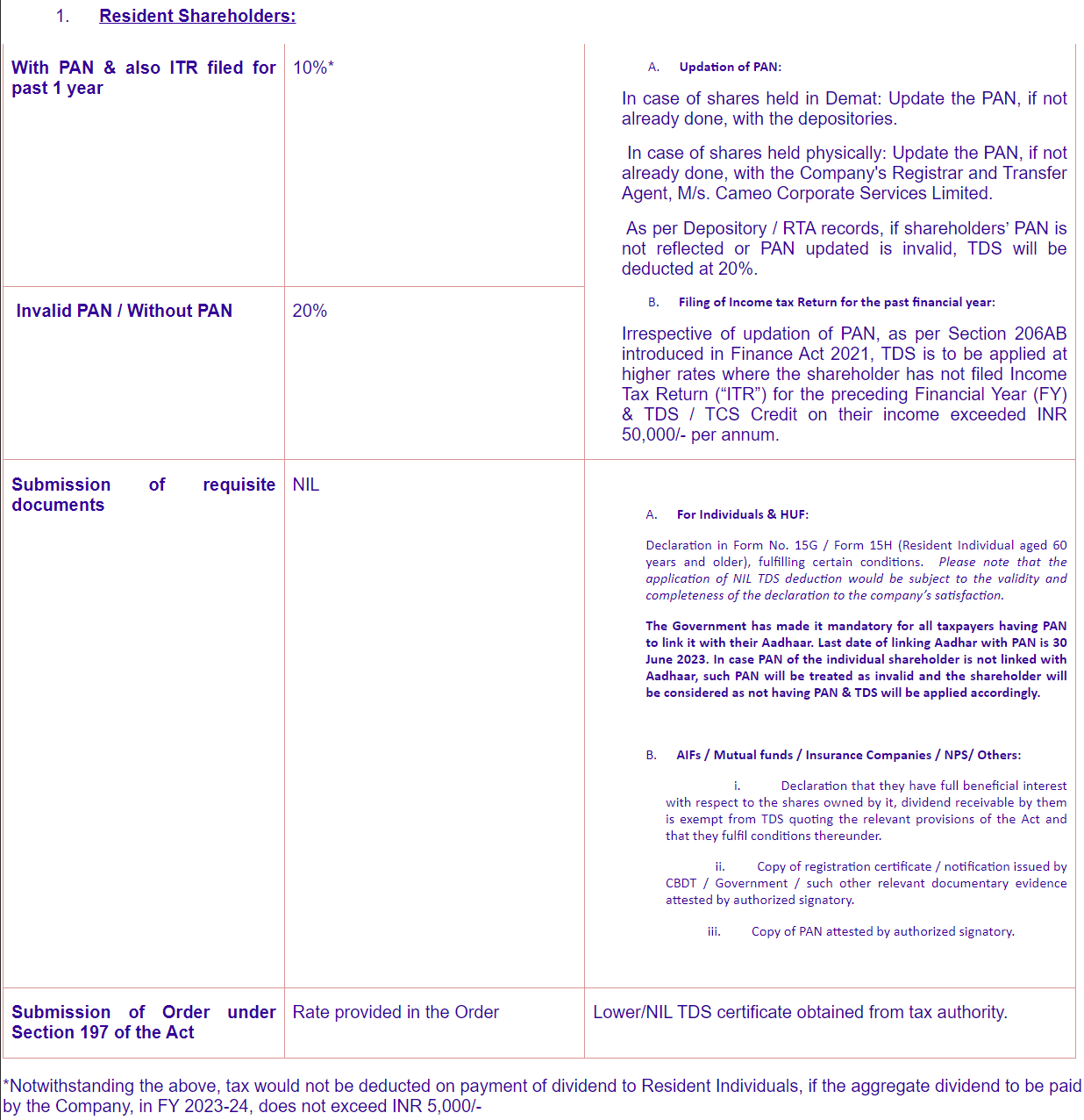
And after the whole table, comes a small line that says:
For most retail investors, the above line and the first row of the table are what's important.
I am not sure if it's a mandatory format mandated by SEBI but certainly, the whole Email can be designed in a more simple format.
Now try it on a real brief
Enter an open UXHack challenge, get feedback from reviewers, and keep the case study for your portfolio.